How to Create a Sales Funnel Chart in Excel

Written by

Reviewed by
This tutorial will demonstrate how to create a sales funnel chart in all versions of Excel: 2007, 2010, 2013, 2016, and 2019.
Sales Funnel Chart – Free Template Download
Download our free Sales Funnel Chart Template for Excel.
In this Article
- Sales Funnel Chart – Free Template Download
- Getting Started
- How to Create a Sales Funnel Chart in Excel 2019+
- Step #1: Create a built-in funnel chart.
- Step #2: Recolor the data series.
- Step #3: Add the final touches.
- How to Create a Sales Funnel Chart in Excel 2007, 2010, 2013, 2016
- Step #1: Create a helper column.
- Step #2: Set up a stacked bar chart.
- Step #3: Hide the helper data series.
- Step #4: Reverse the order of the axis categories.
- Step #5: Recolor the chart.
- Step #6: Adjust the gap width.
- Step #7: Add data labels.
- Step #8: Remove the redundant chart elements.
- Step #9: Shape the chart as a funnel (optional).
- Step #10: Insert the inverted pyramid into the funnel chart (optional).
- Download Sales Funnel Chart Template
A funnel chart is a graph that dissects different stages of a process, typically sorting the values in descending order (from largest to smallest) in a way that visually looks like a funnel—hence the name.
Funnel charts are commonly used in sales, marketing, and human resources management for analyzing the phases a potential customer or candidate goes through as they move toward the end point, be it signing a deal, purchasing a product, or accepting a job offer.
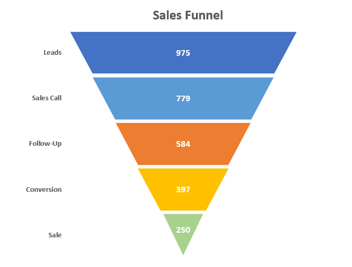
As an example, take a glance at the sales funnel depicting in great detail the customer journey that leads go through to become paying customers—as well as the number of leads that made it through each phase of the sales process, reflected by the width of the bars.
And in this step-by-step tutorial, you will learn how to create this fancy-looking, dynamic funnel chart in Excel, even if you’re a complete newbie.
The funnel chart type was rolled out only in Excel 2019, so those who use earlier versions of Excel have to manually put the graph together on their own. For that reason, this comprehensive tutorial covers both the manual and the built-in methods of building a funnel chart.
Getting Started
To show you the ropes, as you may have already guessed, we are going to anatomize the sales process mentioned before.
Take a peek below at the raw data that will be used for creating the chart:
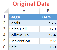
To help you understand the process, we should talk a bit more about the building blocks of the data set:
- Stage: This column characterizes the distinct phases of the recruitment process.
- Users: This column contains the actual values representing the number of prospects that made it through to a certain stage.
Now it’s time to jump right into action.
How to Create a Sales Funnel Chart in Excel 2019+
Let’s start off by covering the built-in method first, which only takes a few simple steps, for those looking for a quick-and-dirty solution.
However, you should be aware of the price you must pay for automating all the dirty work:
- Compatibility issues: The funnel chart type is not available in older versions of Excel, so everyone except for those using Office 365 or Excel 2019 will not be able to see a funnel chart created with this method.
- Poor customization: By definition, sticking to chart templates leaves you somewhat shackled by the rigid parameters of Excel defaults, meaning you lose out a lot on customization options.
For that matter, when you know that the file will be shared with a lot of people, you would be better off creating the chart manually from scratch.
But if those issues are of no concern to you, simply take the shortcut outlined below.
Step #1: Create a built-in funnel chart.
Right off the bat, design a default funnel chart.
- Highlight the entire cell range containing the stages and values (A1:B6).
- Go to the Insert tab.
- Select “Insert Waterfall, Funnel, Stock, Surface, or Radar Chart.”
- Choose “Funnel.”
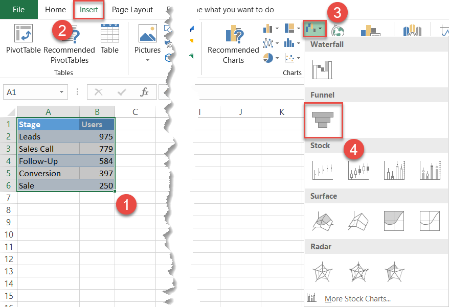
Excel will automatically set up a funnel chart based on the data you fed it:
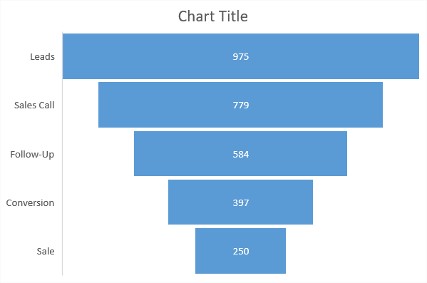
Technically, you have your funnel chart. But you can do a lot better than that by tweaking a just few things to make the chart more pleasing to the eye.
Step #2: Recolor the data series.
Our first step is enhancing the color scheme to transform the chart from dull to eye-catching.
- Double-click on the bar representing the data point “Leads” to select it and right-click on it to open a contextual menu.
- Click the “Fill” button.
- Pick dark blue from the color palette.
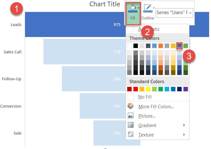
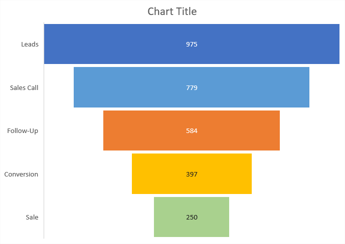
Change the color of the remaining bars by repeating the same process. Eventually, your funnel graph should look like this:
Step #3: Add the final touches.
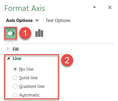
At this stage in the process, you can tweak a few things here and there to make the chart look neat. First, remove the vertical axis border that doesn’t fit into the picture.
To do that, right-click on the vertical axis and select “Format Axis.”
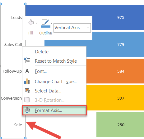
In the task pane, remove the border in just two simple steps:
- Go to the Fill & Line tab.
- Choose “No line.”
Finally, adjust the color and font of the data labels to help them stand out (Home > Bold > Font Color) and change the chart title.
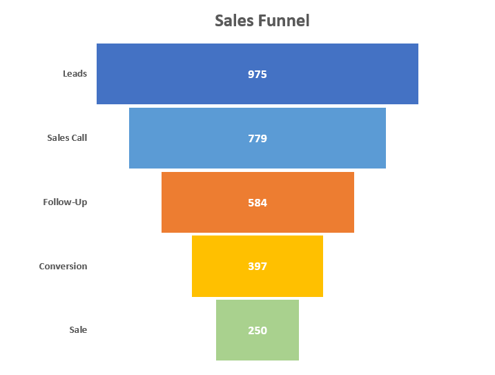
After you have done that, to shape the chart likea funnel (rather than the staggered edges it currently has), skip to Step #9 at the end of the tutorial down below.
How to Create a Sales Funnel Chart in Excel 2007, 2010, 2013, 2016
While we didn’t even have to break a sweat when using the built-in method, it should be obvious that achieving the same result by taking the manual route involves more work on your part.
Regardless of the reasons why you may opt for the manual method—ranging from gaining full control over customization or making the chart compatible with all versions of Excel to simply using an older version of Excel in the first place—in our case, hard work pays off.
Down below, you will find step-by-step instructions covering the process of building this colorful funnel chart in Excel from the ground up.
Step #1: Create a helper column.
At its core, a custom funnel graph is a special hybrid of a center-aligned stacked bar chart. But before we can proceed to build the chart itself, we need to put together some extra data first.
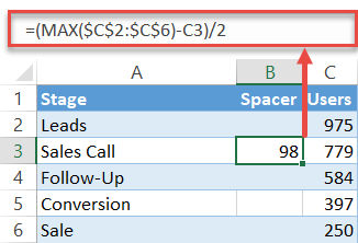
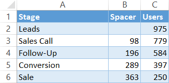
To start with, split the raw data with a spacer column named “Spacer” (column B) that will contain the dummy values for pushing the actual values to the center of the chart plot.
Enter the following formula into the second cell of column Spacer (B3) and copy it down to the end (B6):
=(MAX($C$2:$C$6)-C3)/2This formula computes a helper value proportional to the number of candidates for each phase to help you center the bars the right way.
At this point, your chart data should be organized this way:
Step #2: Set up a stacked bar chart.
You now have all the data you need to put together a stacked bar chart, the stepping stone to the future funnel graph.
- Highlight all the chart data (A1:C6).
- Go to the Insert tab.
- Click “Insert Column or Bar Chart.”
- Choose “Stacked Bar.”
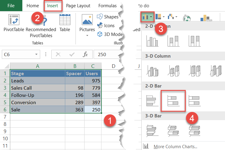
Right away, a simple stacked bar chart will pop up:
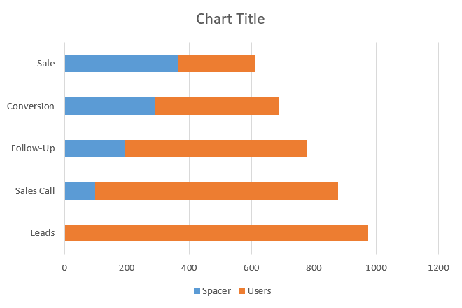
Step #3: Hide the helper data series.
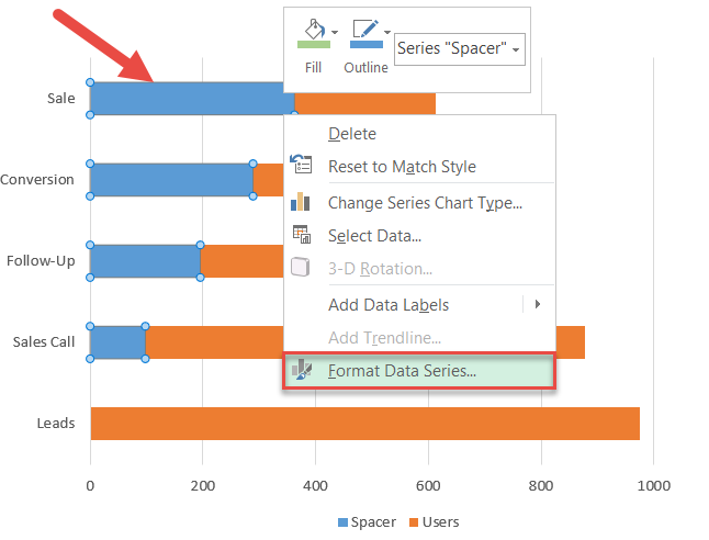
The dummy Series “Spacer” should be hidden, but simply removing it would ruin the entire structure. As a way to work around the issue, make it transparent instead.
Right-click on any of the blue bars representing Series “Spacer” and choose “Format Data Series.”
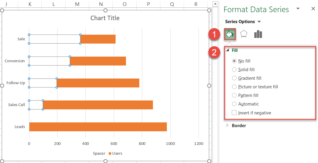
In the Format Data Series task pane, hide the spacer columns:
- Navigate to the Fill & Line tab.
- Under “Fill,” choose “No fill.”
Step #4: Reverse the order of the axis categories.
In a funnel chart, the broad base at the top gradually morphs into the narrow neck at the bottom, not the other way around. Fortunately, you can easily flip the chart upside down by following a few simple steps.
Right-click on the primary vertical axis and choose “Format Axis.”
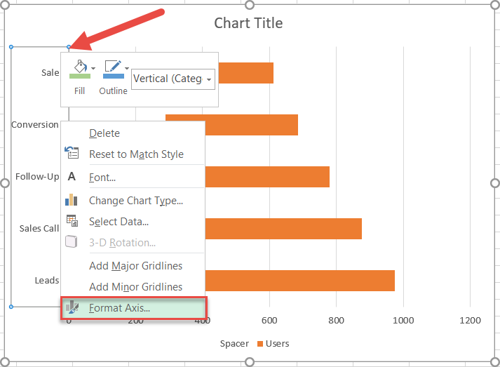
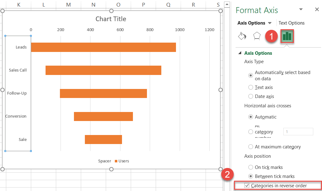
In the task pane, reverse the category order:
- Switch to the Axis Options tab.
- Check the “Categories in reverse order” box.
Step #5: Recolor the chart.
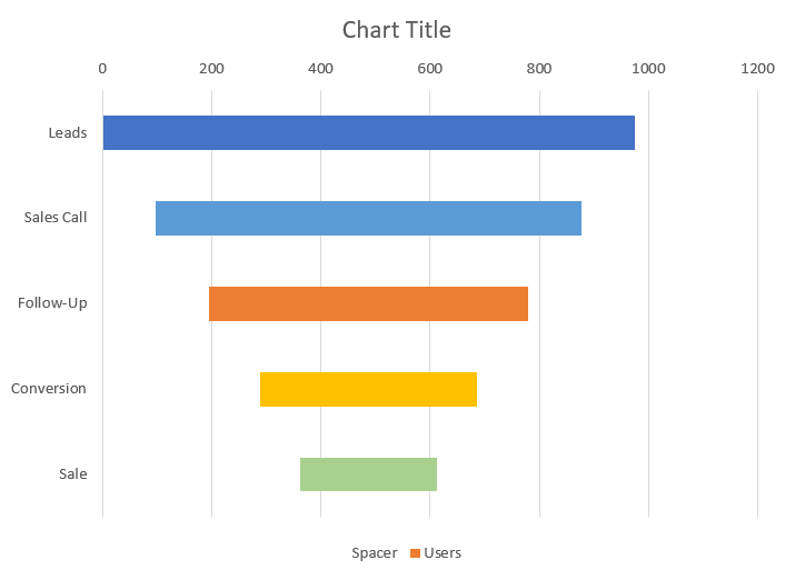
As you proceed with the next steps, each horizontal bar should be congruent with the color scheme of the finished funnel chart.
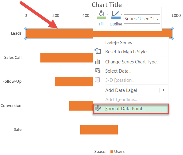
To recolor a given data marker, double-click on the horizontal bar you want to change to select that bar in particular, right-click on it, and select “Format Data Point” from the menu that appears.
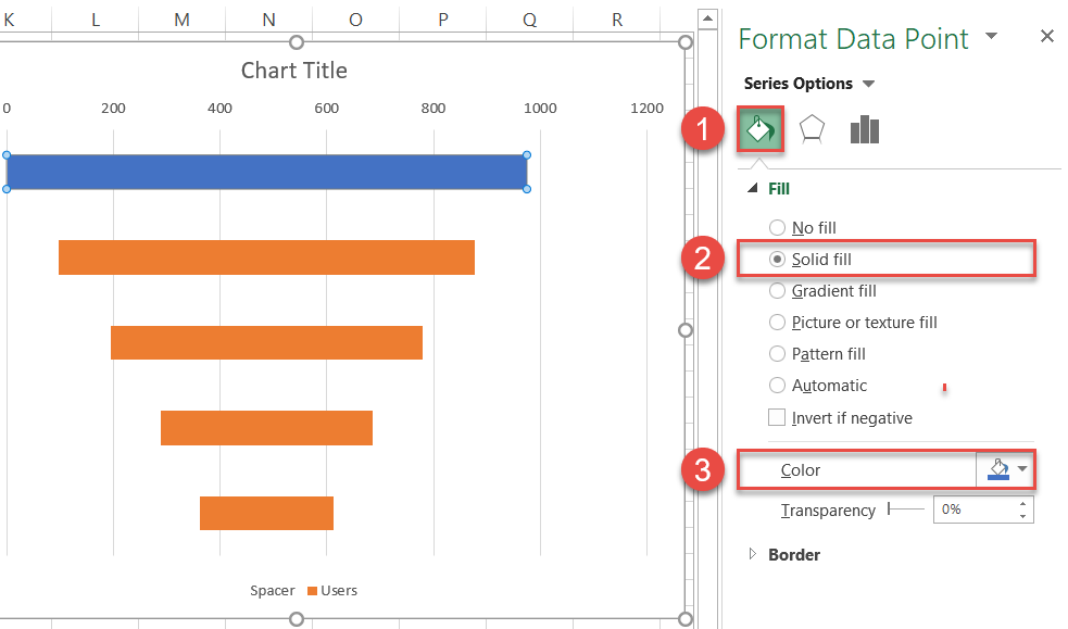
Once the task pane appears, modify the color of that data point by doing the following:
- Go to the Fill & Line tab.
- Under “Fill,” choose “Solid fill.”
- Click the “Fill color” icon and pick dark blue.
Repeat the same process for the remaining bars. After you have adjusted the color scheme, your chart should resemble something like this:
Step #6: Adjust the gap width.
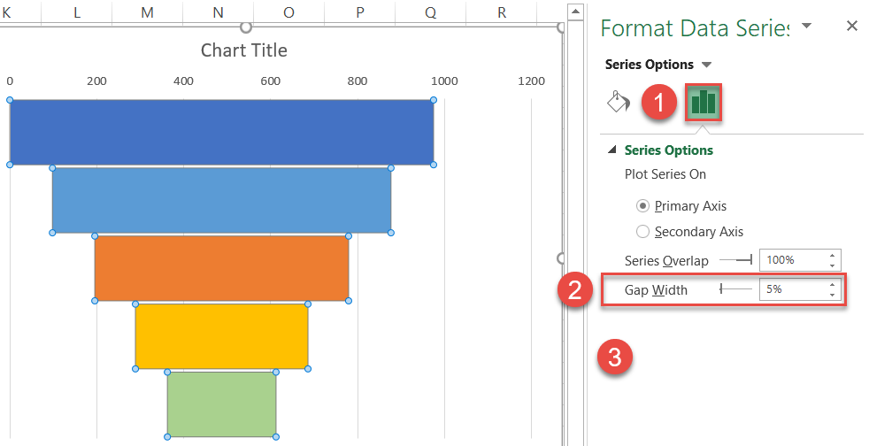
Let’s increase the width of the bars by modifying the gap width of the data series.
Right-click on any horizontal bar, open the Format Data Series task pane, and adjust the value:
- Go to the Series Options tab.
- Set the Gap Width to “5%.”
Step #7: Add data labels.
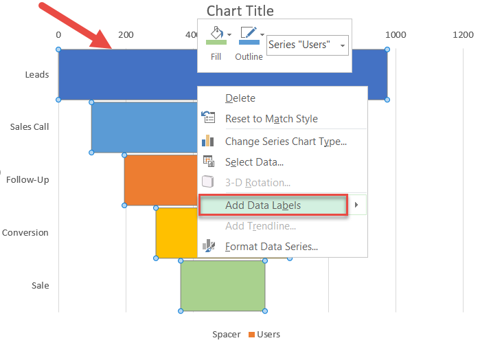
To make the chart more informative, add the data labels that display the number of prospects that made it through each stage of the sales process.
Right-click on any of the bars and click “Add Data Labels.”
Step #8: Remove the redundant chart elements.
Finally, clean up the chart area from the elements that have no use for us: the chart legend, the gridlines, and the horizontal axis.
To do that, simply right-click on the chart element you want to get rid of and choose “Delete.”
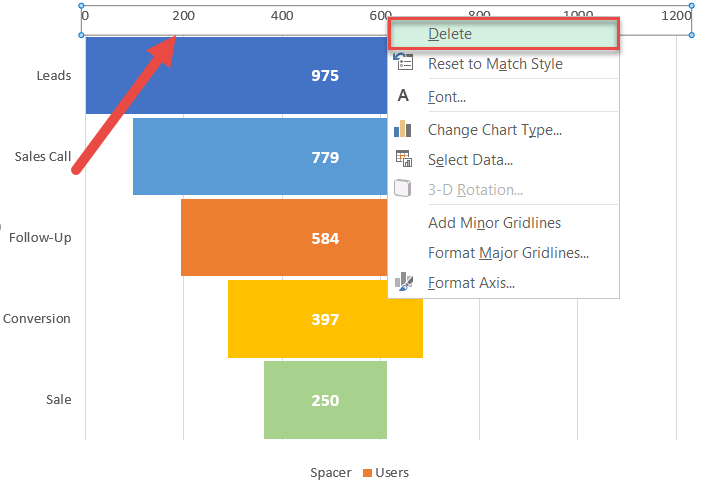
Additionally, remove the axis border (Right-click on the vertical axis > Format Axis > Fill & Line/Fill > Line > No line). Then rewrite the default chart title, and your funnel chart is ready to go!
But there’s more to it. Read on to learn how to visually shape the graph into a funnel.
Step #9: Shape the chart as a funnel (optional).
For those refusing to beat the dead horse of the same rehashed data visuals over and over again, you can trim the horizontal bars to shape the chart into an actual funnel.
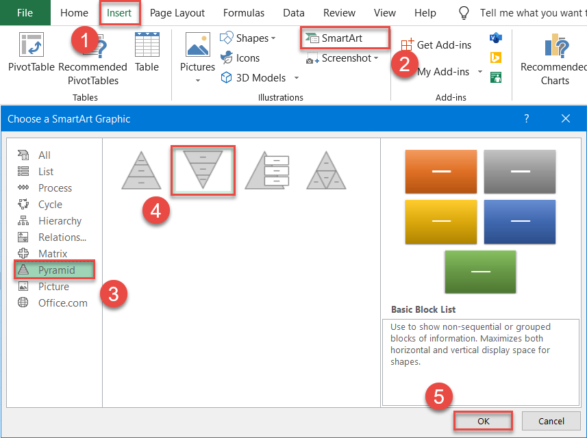
But for the magic to happen, we need to tap into the power of SmartArt graphics. As a jumping-off point, set up an inverted pyramid using the SmartArt feature in Excel.
- Go to the Insert tab.
- Hit the “SmartArt” button.
- In the Choose a SmartArt Graphic dialog box, navigate to the Pyramid tab.
- Choose “Inverted Pyramid.”
- Click “OK.”
Here is what should pop up instantly on your spreadsheet:
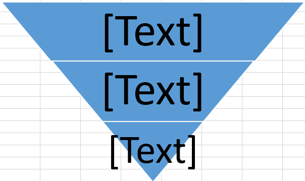
To pull off the trick, the number of pyramid levels should equal the number of categories in the funnel chart—represented by the six stages of the recruitment process.
Three down, two to go. To add the pyramid levels we lack, do the following:
- Select the inverted pyramid.
- Go to the Design tab.
- Click “Add Shape” to add an extra level to the pyramid. Repeat the process as many times as you need.
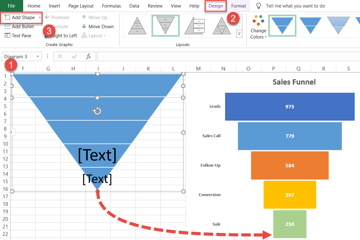
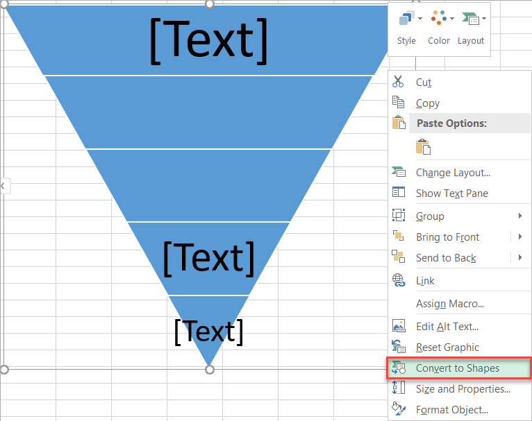
The groundwork has been laid for your streamlined funnel chart. Now, convert the SmartArt graphic into a regular shape so that you can paste it into the funnel chart.
Select the entire inverted pyramid, right-click on it, and choose “Convert to Shapes.”
Finally, replicate the color scheme of the funnel chart.
To recolor one level of the pyramid, double-click on the level to select it, then right-click on it and select “Format Shape.”
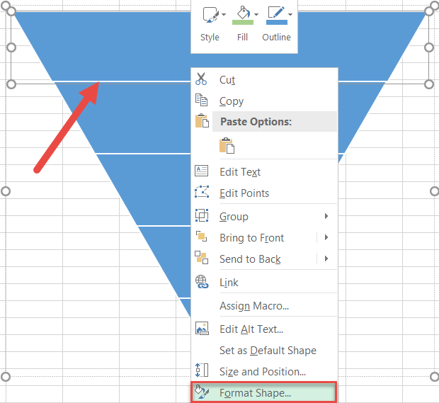
In the Format Shape task pane, go to the Fill & Line tab. Under “Fill,” choose “Solid fill” and pick the color you want.
For your convenience, here is the inverted pyramid you should end up with by the end of this phase:
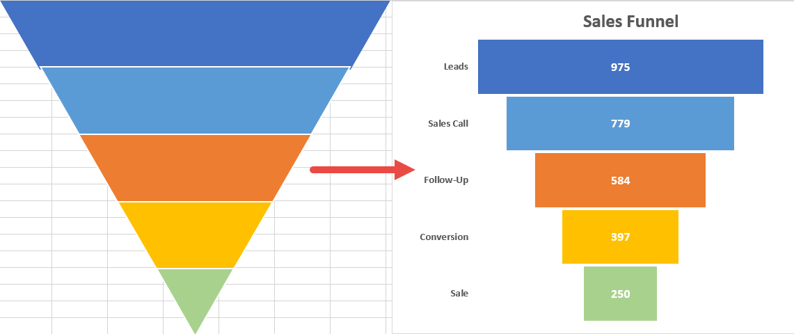
Step #10: Insert the inverted pyramid into the funnel chart (optional).
Having set up the pyramid, insert the shape level by level into the funnel graph by doing the following:
Double-click on the top level of the inverted pyramid, right-click on it, and choose “Copy” or press the key combination Ctrl + C.
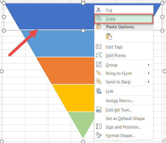
With that level copied to the clipboard, select the corresponding horizontal bar in the funnel chart and open the Format Data Point task pane (Double-click > Right-click > Format Data Point).
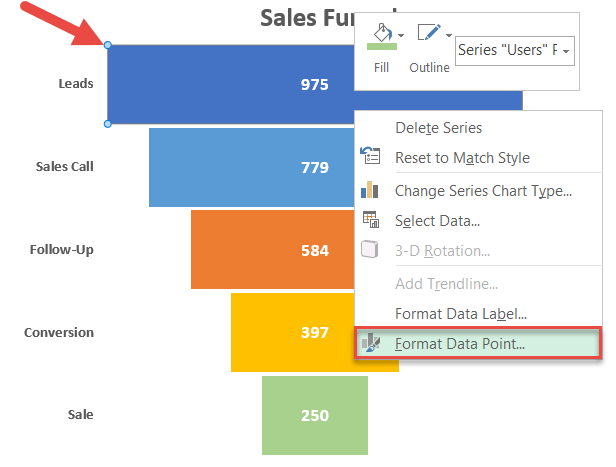
Now, add the copied pyramid level as the “texture fill” of the data point:
- Go to the Fill & Line tab.
- Change “Fill” to “Picture or texture fill.”
- Under “Picture source,” choose “Clipboard.”
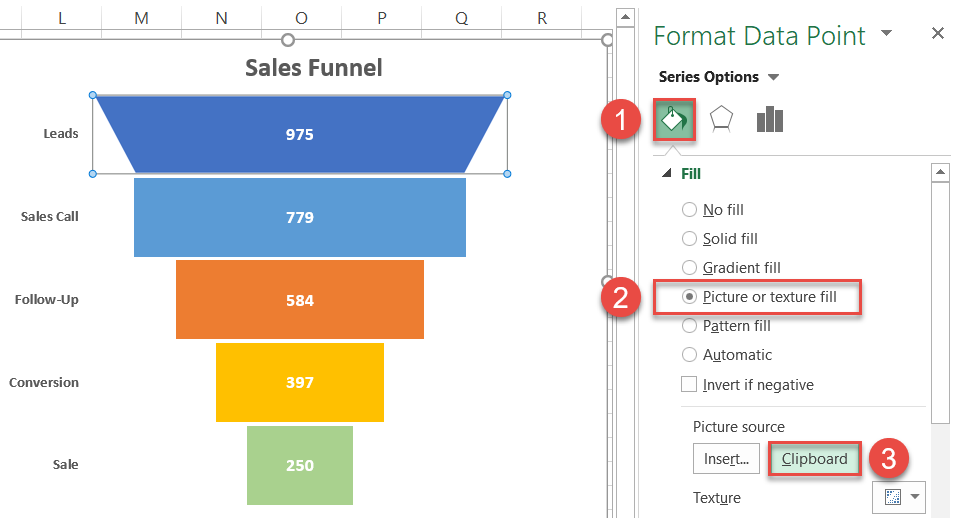
Repeat the process for every single bar of the funnel chart. Ta-da! You have just crossed the finish line and have a stunning sales funnel chart ready to blow everyone away.
Download Sales Funnel Chart Template
Download our free Sales Funnel Chart Template for Excel.